Launching a new website for your hotel can be a daunting task… Sure, it is an exciting creative process, but there are so many obligations to fulfill. (Not to mention all the competing interests from various departments.) The result must be a fine balance of splendid visuals, razor-sharp e-commerce and the latest technology. It needs to act as an effective booking tool, while bringing your brand to life. Your website not only has to compete with similar properties on the market, but battle against the OTAs.
No easy task, right?
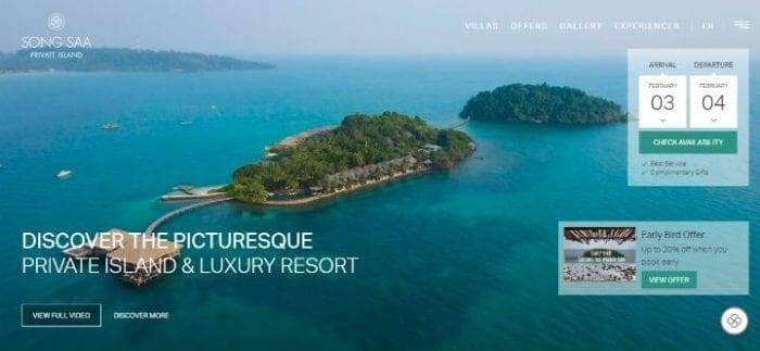 Here is a helpful design guide to showcase what will make your hotel website beautiful and business ready in 2019.
1. Immersive storytelling
- The most successful travel websites offer an immediate feel for the destination. Whether they showcase an edgy urban oasis or an island paradise, the hotel’s personality shines through. To stay true to your brand values, opt for an engaging website design that is an authentic representation of your hotel.
- Let your future guests picture themselves at your property. Impressive full screen videos and high-quality photos can set the scene – encouraging bookings, rather than bounce. Creating beautiful visuals is an investment that will pay dividends over time.
- Support the website design with emotive content, highlight benefits rather than features. Headline your restaurant page with ‘Taste True Mediterranean Flavours‘ as opposed to ‘Seafood Specialties’. Entice with alluring verbiage such as ‘Immerse Yourself In Luxury’’ or ‘Experience Magical Moments’.
2. Book direct drive
- Facing fierce competition and rising commission fees, hotels are on a mission to perfect their book-direct strategies. The most powerful tool in their arsenal is a cleverly designed website with clear navigation and a seamless booking process.
- According to design best practice, the booking panel (or at a minimum a CHECK AVAILABILITY or BOOK NOW button) should be visible at all times. Communicating the benefits of direct reservations, messages such as BEST RATE GUARANTEE or FREE WIFI can guide customers towards conversion.
- In addition to the homepage booking panel, the hotel’s book direct benefits need to be apparent in all key areas. The rooms and special offers pages are usually the most viewed sections on any hotel website – making use of strong call-to-action messages is crucial on these pages.
3. Mobile first experience
- As phone usage has overtaken desktop browsing, putting mobile experience first is now an absolute necessity for hotels. Responsive websites offer the perfect solution. Using flexible layouts, it detects the visitor’s screen size – mobile, laptop or tablet – and changes the look of the webpage accordingly.
- To maximise conversion on mobile devices, it is best to aim for simplicity. Call-to-action buttons must be kept front & center, menus are to be short & sweet and the booking process needs to be straightforward. Since users navigate with their thumb, key features have to be within easy reach.
- Keep in mind that your mobile site may not be an exact replica of your the desktop design. For faster load time or to better adapt to a smaller screen, some features may be omitted or altered on the pocket version.
4. Micro interactions
- Micro interaction are the small responses users notice when they complete certain actions online. They can be expressed in a multitude of ways such as sounds, chimes or animation. (It can be as simple as images moving when the visitor hovers over with the mouse.)
- Interacting with the audience creates a sense of control – transforming passive viewers into willing participants. These visual and audio cues make browsers more aware of their actions on the site, while bringing attention to certain features.
- Welcoming and delighting users, micro interactions also provide instant feedback and create engagement.
5. Bold headlines
- Eye-catching headlines can really make a statement – not just by conveying important information, but instantly setting the tone for your website. What’s your brand persona? Classical? Edgy? Playful? Find the perfect font style to match your hotel’s personality.
- Visitors often just glance at websites, but bold statements can keep them engaged longer and lead them through more content by design.
- With the evolution of technology, designers have a lot more freedom nowadays to choose unusual web fonts without compromising legibility on smaller devices.
6. Asymmetry and broken grid layouts
- Breaking the traditional rules of design can lend a distinctive look to websites. If you represent a youthful, vibrant brand, consider introducing out-of-the-box concepts.
- Asymmetrical layouts make pages look more dynamic and exciting. Visitors will be entertained longer and more inclined to stay on your site.
- Unusual positionings, multiple layers, accent colours, illustrations and many more techniques can be deployed to create a unique visual display.
7. Inventive menus & navigation
- Mega menus expand to wider or full page panels – bringing more movement to websites. Ideal for hotels with a wide range of offering such as spa, golf, weddings and multiple dining outlets.
- Keeping the navigation menu in a fixed place (such as the top of the page) enables users to switch pages from anywhere on the site and keep the booking panel in sight at all times. Fixed navigation entices visitors to stay longer on the site and increases the total number of page views.
- Vertical navigation can present multiple choices easily which makes it ideal for rooms and special offers pages. This design gives an immediate snapshot of all available options and shows content concisely.

