 Hotels are immersive settings with the ability to elicit emotions, create moods, and leave long-lasting imprints. They are more than just sleeping accommodations. Hoteliers and interior designers must master both the art and science of comprehending the significant effect that colour has on our thoughts, feelings, and behaviours within these places.
Each colour choice made for a hotel environment has a specific function, from the cosy embrace of earthy tones to the energizing allure of brilliant colours. In this blog, let’s discover some creative hotel room colour combinations and how they can be used to design environments that calm, energise, and inspire, turning your next hotel stay into a rich, emotional trip rather than just a place to sleep.
1. Content and calm – blue and green
The peaceful qualities of blue make it a popular hotel room colour option for areas such as hotel guestrooms and lounges. It is perfect for settings where visitors are looking for a peaceful break because of its exceptional capacity to reduce tension and promote relaxation. On the other hand, the colour green is intimately associated with nature and conveys a feeling of balance and harmony. This colour is a natural choice for eco-aware or wellness-focused hotels since it represents rebirth and freshness. When combined, the colours blue and green provide a calming atmosphere that promotes tranquillity and a sense of well-being, transforming hotel rooms into serene havens where visitors can disconnect from the pressures of the outside world. You can create a balanced combination of these relaxing tones in your hotel kitchen by choosing blue colour tiles for the backsplash and green tiles for the countertops or accessories. This will convey a light and airy feeling.
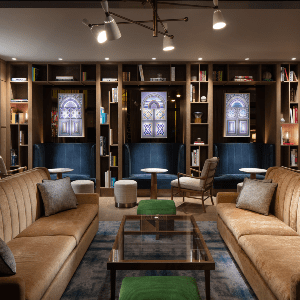
2. Strong and striking – black and gold
If you are looking for a Hotel interior colour, consider black as your ultimate option. Black has a special function in hotel design because of its air of refinement and modernity. When used carefully, black colour can offer depth and contrast, creating a feeling of drama, such as in stunning black tile designs or elegant furniture. You can use Black tiles design to embrace the beauty of flooring. Hotel rooms become opulent realms when black and gold, a colour associated with wealth and richness, are combined. Black and gold complement each other to create an unmistakable aura of opulence, making visitors feel like royalty during their stay. This combination is ideal for upmarket and boutique hotels looking to make a strong statement.

3. Bright and relaxing – yellow and blue
Yellow is a happy and enthusiastic colour. It quickly makes guests feel at ease when it is incorporated into hotel common areas like lobbies or dining areas since it emits warmth and optimism. Strategically paired with calming blue, this combination achieves a pleasing equilibrium. It makes areas more cheery and inviting while promoting rest. This combination is frequently used in public spaces where visitors congregate, fostering social interactions and creating an environment that is warm and pleasant overall. Use yellow tiles to create a cheery, cosy feeling in your hotel bathrooms. On the other hand, Blue tiles can inspire a tranquil, restful atmosphere when used in bedrooms or hall areas.
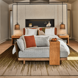
4. Always in trend – neutrals
The neutrals’ colour palette, which includes beige, taupe, and grey, provides a timeless and adaptable foundation for hotel interiors. Opting for a Neutral colour is an effective choice for hotel room colour as they stand for brevity, cleanliness, and minimalism. In hotel rooms and hallways, neutral colours offer a calm background that lets other design components, such as artwork and furnishings, take the spotlight. This focus on minimalism fosters a calm, orderly ambience that makes visitors feel at ease and at home in their surroundings’ modest beauty. Create a relaxing and timeless atmosphere in any space by using neutral-coloured tiles as an adaptable backdrop, or combine them with vivid accents for stunning contrast and well-balanced aesthetics in your hotel rooms.
5. Clean and serene – green and white
A setting that exudes cleanliness and tranquillity features white, which symbolises purity and space, and green, which is linked to balance and rebirth. The combination of these colours heightens the tranquillity in hotel spas and wellness facilities where rejuvenation and relaxation are priorities. A calming and peaceful atmosphere surrounds visitors, making their stay a rejuvenating experience where they may escape daily life’s worries. In hotel bathrooms or spa facilities, use green tiles to create a tranquil, natural atmosphere. Or opt for White tiles to create a clean, classic aesthetic in hotel lobbies or dining areas. When in search of a hotel room colour combination, you can combine green with white.
6. Radiant and rich –reds and oranges
Reds are a great choice for hotel restaurants and bars because they exude boldness and passion, stimulate the senses, and foster a sense of excitement. Red’s vivacious vitality promotes interaction and improves eating occasions. On the other hand, oranges exude a cheery brightness that makes social spaces welcoming and pleasant. The mix of these hues guarantees that visitors are treated to mouthwatering fare and a dynamic and engaging ambience that makes a lasting impression.
7. Extravagance – purple and violet
Luxurious, imaginative, and sophisticated attributes are associated with purple and violet. These hues quickly exude richness when used in the architecture of posh hotels. They foster an environment that pampers and elevates visitors, improving their experience in general. Accents in purple and violet can make a hotel stay luxurious and unique, leaving visitors with memories of unmatched enjoyment. These colours can be used in the décor, furniture, or lighting.
Conclusion
The psychology of colour significantly impacts how guests perceive the world of hotel design. Each colour, when skillfully blended, can evoke strong feelings, create moods, and leave an enduring impression. These colours have the power to change hotel areas into intriguing settings, from the tranquillity of blue and green to the luxury of black and gold. Colour decisions affect all aspects of a visitor’s trip, whether it’s the warm welcome of yellow and blue or the classic elegance of neutrals. Therefore, understanding the psychology of colour for walls or interiors or tiling of floors or walls is essential to the art of hotel interior colour if you want to provide every traveller with a unique, emotive experience.