 Important Design Ideas to Understand Customer Needs
 Important Design Ideas to Understand Customer Needs
With the demand for engaging artwork increasing, it has become important for designers to understand the customers’ psychology properly. This will help them to craft any artwork based on their requirements. It can build the lacking connection between the designers and customers, making the design look really attractive.
To understand this deep customer psychology, you need to know about some specific tips. These guidelines help to analyze the thinking of customers and what they want in a graphic design. This allows you to create better designs that can engage, attract and convert customers quickly.
Being a designer, you don’t have to do a Ph.D. in psychology to understand what a customer wants. These things can be figured out by looking at their services and business background. You can easily find relations by analyzing them collectively. This gives you a perfect pathway to design creative stuff, just as the way they want.
Below, we have defined 6 key points that will help you to know about the customer needs. Let’s explore them in detail below.

Gestalt Principles – What Are They?

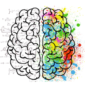
We all know that the theory of psychology isn’t new. It is something that stays in the focus in every field, rightly due to the variance in human behavior. As a designer, you can understand the diversity of human psychology by looking at the gestalt principles.
But, what do these principles say?
Well, gestalt basically means a “unified whole”. It provides a great illustration of how users see different types of graphic designs and try to connect them with some sort of unified point. They look for the relation between different design elements, as to how they are connecting and portraying a unified message of a brand.
To understand gestalt principles, you need to know about certain groups in which people try to accommodate different design elements. Here are some of them given below.
Similarity
When users see certain objects that look similar to other materials, they quickly start to perceive them as a group of objects. They try to find relations in their designs, so that their correlation can be found. This similarity can be found in different types of attributes such as colors, styles, typography, and more others.
Looking from the perspective of users, these similarities help them to identify a number of things. They can understand what a design is trying to communicate and how its elements are similar to others.
Continuation
Another thing that will help you understand the gestalt principles is the continuation of the design. It is a natural instinct that makes human eyes move quickly from one object to another. That is because they find some sort of continuation in their building through specific objects.
This provides designers a stunning opportunity to connect different elements with each other. It provides a unified picture that helps to portray a complete message through design.
Proximity
Sometimes, when you place different objects within close proximity, they look like a singular object. This is basically a unique quality of human eyes that sometimes it also perceives diverse objects as one. It relates directly with the core idea of the gestalt principle, showing how an artwork designed with different elements can portray a unified image.
Figure Separation
The human eye has also got an incredible ability to look at an object closely by separating the background. This is also called focus and it makes you see objects clearly no matter how dense or deep they are.
Sometimes, a specific element gets highlighted in the design, rightly due to its visual quality. It basically comes in the focus of customers and they perceive different ideas by looking at them. This shows how a single element can also illustrate the whole design message, connecting customers to the core idea.
Instinctual Reaction to Design
Sometimes, you might have seen particular designs with a quick feeling of recognition. This basically happens when you see and like them at the first glance, rightly due to their creative design. It is not a common thing, because it is related directly to the instinctive memory of your brain.
This particular response is also called Visceral reaction. It is evoked when you see a specific design for the first time, but its core elements are not new to you. Their creative visuals look delicate to your eye, making your inner instinct to like them quickly.
This is one of the best techniques you can use in your designs to build a strong connection with the customers. Using precise elements, you can ensure that your design will grab customers’ attention and will encourage them to take interest in it.
Being a designer, you can easily know what precise design elements can attract people’s eyeballs. It is simply not difficult to know what things people like and dislike in a particular design. Once you will know about them, the design will relatively become easier for you. It will be more focused and client-oriented, allowing you to build a strong impression at the first glance.
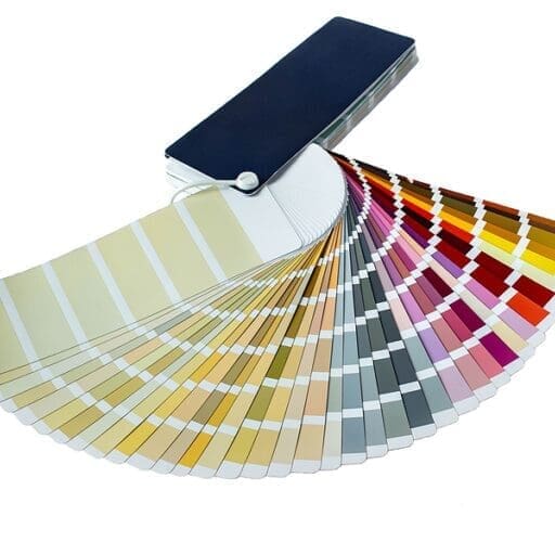
Colors that Evoke the Right Emotion
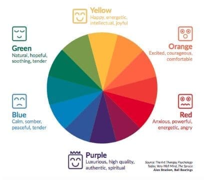
We all know very well the deep psychology of colors. It has always remained a truth that colors can influence people’s choices, likes, and dislikes if used appropriately. They hold the power of changing your perspective and making you like even meager things.
As a designer, you need to understand the meaning and impact of every color and how they change the psychology of human likings. It can directly bring tons of advantages to your designs, giving you a great skill to craft eye-catching stuff.
It will help you to know what colors customers really like and how you can build your designs according to them. This way you can choose the right shades that can grab customers’ attention, as well as portray a perfect message of your design.
For instance, red is always used to promote strong, passionate, and bold feelings. Similarly, colors like orange and yellow are used to express excitement and happiness. Their usage in the design should be done smartly knowing their visual impact on the minds of customers.
This way you can not only decide the colors better, but can also use them perfectly in your designs. It can help you to create unique designs, blended with the perfection of catchy colors that can win customers’ attention.
How Many Choices Are Too Many?
Sometimes, designers get confused with the availability of too many choices. This thing is also illustrated in Hick’s Law, defining why too many choices can slow down your designing pace. It makes it harder for you to choose anything, as your mind doesn’t stick to one object.
Be it products or images, you need to focus on fewer but quality objects to make your designing process fast and effective. When you will get more choices, you cannot make your mind to focus on one designing path. It gets dispersed into multiple choices which basically results in lesser quality and longer time of designing any artwork.
Therefore, try to work with minimum yet qualitative design options always. It will help you to give your best, as required by the customers.
Leverage the “Isolation Effect” to Stand Out
When creating a logo, flyer, or any branding material, designers always try to bring something unique in their work that can separate them from the rest.
Why is that required?
Because, it can help them to stand apart from the conventional work, giving them a greater edge. This particular thing can also be understood by looking at the isolation law called the “Isolation Effect”. It basically describes that objects that look unique in a group of identical things always grabs people’s attention. It makes them focus on those objects, allowing their minds to take interest in them.
This particular principle is quite relatable for the designers. They can make their work noticeable to the customers, precisely by using creative elements and styles. It can not only make their designs beautiful, but can give them a spectacular look among all as well.
Recognition over Recall
The concept of recognition over recall is also very important for designers. It allows them to understand the psychology of customers, as to how they see different patterns to recognize the meaning of any design.
The best way to understand this is by looking at the design patterns of any company’s website and mobile application. Both of these things are designed with a combination of similar colors, typography, and other attributes. That is because they are meant to be used frequently by the customers that are associated with that company.
Using them, they will get an idea about the theme of a company and how it stays easily recognizable on different platforms. This will build a sense of recognition among them whenever they will come across anything related to the company. They will quickly get to know the identity of a company, precisely by analyzing their creative design pattern.
Final Words
That brings us to the end of this blog in which we have defined the basics of design psychology and how it helps you to understand the customer’s requirements. It has now become very important for designers to know what their customers want and how they can craft it using different elements. This will help them to make their designs stand out and get more recognition for them in the market.